.png)
Airbnb 2016 Project
Introduction
This was my first project demonstrating my skills in data cleaning and visualisation. The data is a representation of Airbnb listings, calendar, and reviews of Seattle in the year 2016. The dashboard is interactive and was made using Tableau.
-57f4e00f.png)
Step 1 Data Cleaning:
The first step was to clean the data in Excel, this included checking for:
Identify and eliminate duplicate data.
Repair data errors.
Handle missing data.
Validate the data
Step 2 Data Visualisation
The next step was to import the data into Tableau and determine the relationship between different tables.
Visualisation 1: Price by Zip code
The visualisation below presents the prices of Airbnb listings by zip code.
.png)
Visualisation 2: Price per Zip code
This visualisation maps out the prices per zip code.
.png)
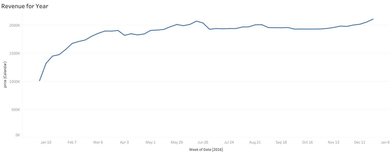
Visualisation 3: Revenue for 2016
The visualisation represents a graphical chart of the revenue performance.

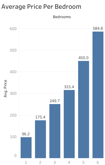
Visualisation 4: Average Price per Bedroom
The following bar chart presents the average price per bedroom

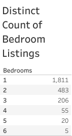
Visualisation 5: Distinct Count of Bedroom Listings
The table below displays the distinct count of each bedroom listing

Conclusion
This project reveals that regardless of the size of the property, a person could generate passive income from renting out their property. This project can also be used to discover the performance of similar properties, for example, six-bedroom properties have the highest average price and least competition in terms of the number of listings.
-57f4e00f.png)

